
No products in the cart.
25%
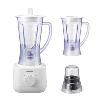
Panasonic 450W Blender 1L With 2 Jars And Dry Mill – MX-EP3171 | Effortless Everyday Blending
Original price was: රු29,000.රු21,900Current price is: රු21,900. or 3 X රු8,111 with 


Credit Card Instalments from Rs. 450.62/month
29%
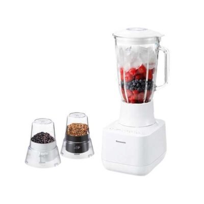
Panasonic 700W Glass Jug Blender with 2 Dry Mills – MX-MG5321 | Powerful Smooth Blending Performance
Original price was: රු37,500.රු26,900Current price is: රු26,900. or 3 X රු9,963 with
Credit Card Instalments from Rs. 553.50/month
9%
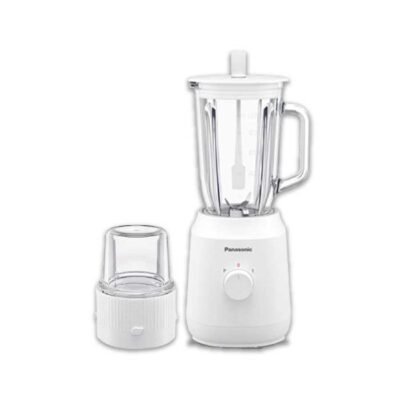
Panasonic Blender with Wet and Dry Mill 400W – MX-EX1081 | Powerful Efficient Kitchen Performance
Original price was: රු22,900.රු20,900Current price is: රු20,900. or 3 X රු7,741 with
Credit Card Instalments from Rs. 430.04/month
25%

Panasonic 600W Hand Held Blender – MX GS1 – Powerful Smooth Blending Performance
Original price was: රු24,900.රු18,900Current price is: රු18,900. or 3 X රු7,000 with
Credit Card Instalments from Rs. 388.89/month
37%
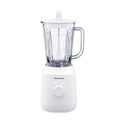
Panasonic Blender MX-EX1001 with Jar
Original price was: රු29,999.රු18,990Current price is: රු18,990. or 3 X රු7,033 with
Credit Card Instalments from Rs. 390.74/month